Screenshot a website as a phone shows it
To see how a website looks on a phone, paste its address into CurlShot and choose Phone. CurlShot opens the page with a phone-sized screen, the phone's pixel density and a mobile browser identity, so the site serves its mobile layout, and returns a screenshot of it. Tablet and computer views work the same way.
No address handy? Try
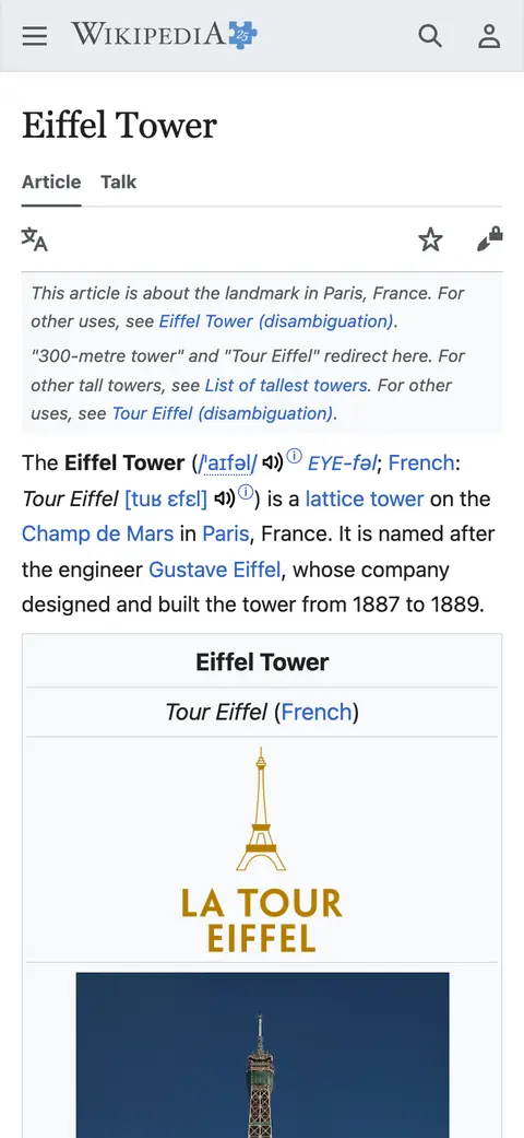

The example stops here. The real page goes on.
This is an example: wikipedia.org on a phone, whole page, pictured with CurlShot. Paste an address above to make your own.
Ads and cookie pop-ups hidden. This page has none, so the screenshot is the same either way.
No account needed to try it. A free account gives you 100 screenshots a month, no card needed.
Create a free accountHow to do it, in three steps
- 1
Paste the address of the website into the box.
- 2
Choose "Phone" or "Tablet".
- 3
Press "Take the screenshot", then download the image.
What people use it for
- Check your own site on a phone without a phone at hand
- Show a client how their shop looks on mobile
- Compare the phone, tablet and computer layout of a page
- Catch a broken mobile layout after a change
For developers: one request
The same thing from your own code. It is a plain HTTP request, so it works from any language. Create a free account to get an access key.
curl "https://curlshot.com/api/v1/screenshot?access_key=YOUR_ACCESS_KEY&url=https://example.com&viewport_device=iphone_15_pro&full_page=true" \
--output phone.pngQuestions people ask
How can I see what my website looks like on a phone?
Paste the address into CurlShot and choose Phone. You get a screenshot of the mobile version of the page, as a phone would show it.
Which devices can I choose?
On this page: a phone, a tablet and a computer. The API has a list of named devices, including current iPhone, Pixel and iPad models and common laptop and desktop sizes, and you can also set any width and height yourself.
Is this a real phone?
No. It is a real browser set up like the phone: the same screen size, pixel density, touch support and browser identity. That is what decides which layout a site serves, so the result matches what the phone shows for almost all sites.
Is it free?
You can try it on this page without an account. A free account adds a monthly allowance of screenshots and keeps them in one place.
Related tools
- Full-page screenshotTake a screenshot of a whole web page, from the top to the very bottom, as one image. Paste the address, nothing to install. Also available as an API.
- Website thumbnailMake a thumbnail or preview image of any website from its address. For directories, link lists, portfolios and newsletters. Free to try, one request by API.
- Screenshot APIA screenshot API for developers. One HTTP request turns a URL, HTML or Markdown into a PNG, JPEG, WebP or PDF. Full page, devices, blocking, cache, MCP.