Devices
Capture a page as a phone, tablet, laptop or desktop would show it, using one option and a list of ready-made presets.
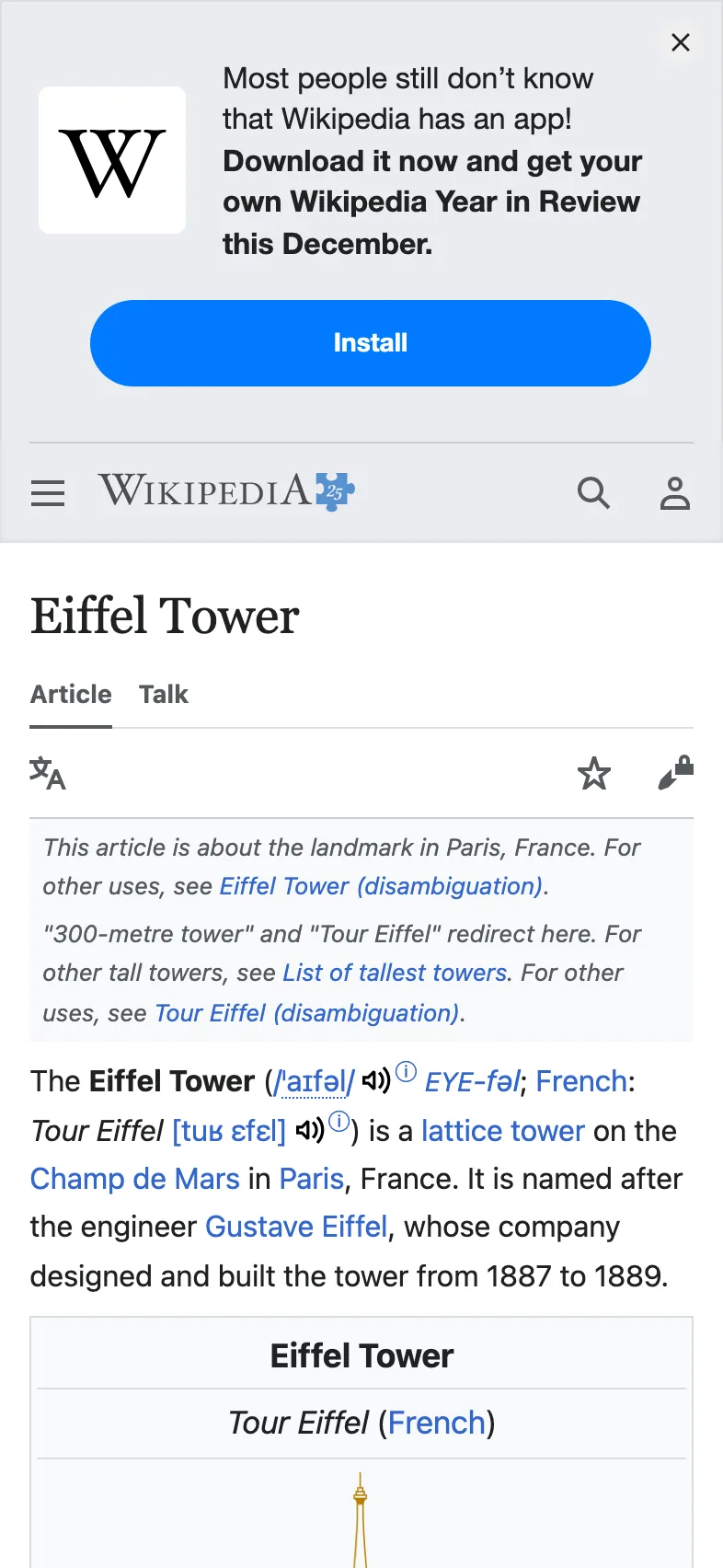
Add viewport_device and the page is drawn as that device would show it.
curl "https://curlshot.com/api/v1/screenshot?access_key=YOUR_ACCESS_KEY&url=https://en.wikipedia.org/wiki/Eiffel_Tower&viewport_device=iphone_15_pro" \
  --output eiffel-iphone.png
You get the mobile version of the article, in a file that is 1179 by 2556 pixels.
#What a device preset sets
A preset is a bundle of settings with a name. One value of viewport_device sets all of these:
| Setting | What it means | iPhone 15 Pro |
|---|---|---|
| Width and height | The size of the viewport. The viewport is the browser window the page is drawn in. | 393 x 852 |
| Pixel density | How many image pixels are drawn for each page pixel. | 3 |
| Mobile layout | Whether the page is treated as a phone or tablet page. | yes |
| Touch | Whether the browser reports a touch screen. | yes |
| User agent | The browser name sent to the site. Some sites pick their layout from it. | iPhone Safari |
Presets for phones and tablets turn on the mobile layout. Presets for laptops and desktops do not.
Without a preset, the page is drawn in a 1280 by 1024 window at density 1, as a desktop browser.
#Try a tablet
Change one word and you get a different device.
curl "https://curlshot.com/api/v1/screenshot?access_key=YOUR_ACCESS_KEY&url=https://en.wikipedia.org/wiki/Eiffel_Tower&viewport_device=ipad" \
  --output eiffel-ipad.png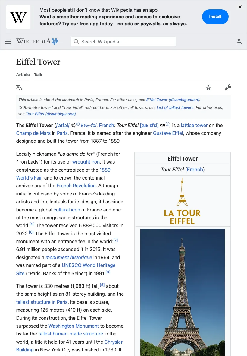
The name is forgiving about spelling. iphone_15_pro, iphone-15-pro and iPhone 15 Pro all pick the same preset.
#Pixel density in one line
Pixel density multiplies the image size: a 393 x 852 viewport at density 3 gives a 1179 x 2556 image, with sharper text and the same layout.
That is why device screenshots are larger than the viewport numbers suggest. The option behind it is device_scale_factor. The default is 1. The largest value is 3. For full-page screenshots, your plan can set a lower maximum.
#Override part of a preset
Any viewport option you send yourself wins over the preset. The rest of the preset stays.
This keeps the iPhone layout and user agent, but asks for density 1, so the file is a light 393 by 852 pixels:
curl "https://curlshot.com/api/v1/screenshot?access_key=YOUR_ACCESS_KEY&url=https://en.wikipedia.org/wiki/Eiffel_Tower&viewport_device=iphone_15_pro&device_scale_factor=1" \
  --output eiffel-iphone-small.png
You can override these:
viewport_widthandviewport_height, for a taller or shorter first screen.device_scale_factor, for a lighter or sharper file.viewport_mobile, to turn the mobile layout on or off.user_agent, to send your own browser name.
#Landscape
Phone and tablet presets are in portrait, which means taller than wide. Add viewport_landscape=true to turn the device on its side.
curl "https://curlshot.com/api/v1/screenshot?access_key=YOUR_ACCESS_KEY&url=https://en.wikipedia.org/wiki/Eiffel_Tower&viewport_device=ipad&viewport_landscape=true" \
  --output eiffel-ipad-landscape.png
The iPad viewport becomes 1180 by 820 in place of 820 by 1180.
The default is false. On a preset that is already wider than tall, such as a laptop, it changes nothing.
#Without a preset
You do not need a preset to get a phone-sized screenshot. Set the numbers yourself:
curl "https://curlshot.com/api/v1/screenshot?access_key=YOUR_ACCESS_KEY&url=https://en.wikipedia.org/wiki/Eiffel_Tower&viewport_width=400&viewport_height=800&viewport_mobile=true&device_scale_factor=2" \
  --output eiffel-custom.png
viewport_mobile=true matters here. It makes the browser respect the page's own mobile settings, the way a phone does. Without it, a narrow window is still treated as a desktop browser.
The width can be from 100 to 3840 pixels. The height can be from 100 to 4320 pixels.
#All devices
#Phones
viewport_device | Device | Viewport | Pixel density | Mobile layout |
|---|---|---|---|---|
iphone_se | iPhone SE | 375 x 667 | 2 | yes |
iphone_12 | iPhone 12 | 390 x 844 | 3 | yes |
iphone_13 | iPhone 13 | 390 x 844 | 3 | yes |
iphone_13_mini | iPhone 13 mini | 375 x 812 | 3 | yes |
iphone_14 | iPhone 14 | 390 x 844 | 3 | yes |
iphone_14_plus | iPhone 14 Plus | 428 x 926 | 3 | yes |
iphone_14_pro | iPhone 14 Pro | 393 x 852 | 3 | yes |
iphone_14_pro_max | iPhone 14 Pro Max | 430 x 932 | 3 | yes |
iphone_15 | iPhone 15 | 393 x 852 | 3 | yes |
iphone_15_plus | iPhone 15 Plus | 430 x 932 | 3 | yes |
iphone_15_pro | iPhone 15 Pro | 393 x 852 | 3 | yes |
iphone_15_pro_max | iPhone 15 Pro Max | 430 x 932 | 3 | yes |
iphone_16 | iPhone 16 | 393 x 852 | 3 | yes |
iphone_16_plus | iPhone 16 Plus | 430 x 932 | 3 | yes |
iphone_16_pro | iPhone 16 Pro | 402 x 874 | 3 | yes |
iphone_16_pro_max | iPhone 16 Pro Max | 440 x 956 | 3 | yes |
pixel_5 | Pixel 5 | 393 x 851 | 2.75 | yes |
pixel_7 | Pixel 7 | 412 x 915 | 2.625 | yes |
pixel_8 | Pixel 8 | 412 x 915 | 2.625 | yes |
pixel_8_pro | Pixel 8 Pro | 448 x 998 | 3 | yes |
pixel_9 | Pixel 9 | 412 x 923 | 2.625 | yes |
pixel_9_pro | Pixel 9 Pro | 410 x 914 | 3 | yes |
galaxy_s23 | Galaxy S23 | 360 x 780 | 3 | yes |
galaxy_s24 | Galaxy S24 | 360 x 780 | 3 | yes |
galaxy_s24_ultra | Galaxy S24 Ultra | 384 x 824 | 3.75 | yes |
galaxy_a54 | Galaxy A54 | 360 x 800 | 3 | yes |
#Tablets
viewport_device | Device | Viewport | Pixel density | Mobile layout |
|---|---|---|---|---|
ipad | iPad (10th gen) | 820 x 1180 | 2 | yes |
ipad_mini | iPad mini | 744 x 1133 | 2 | yes |
ipad_air | iPad Air | 820 x 1180 | 2 | yes |
ipad_pro_11 | iPad Pro 11" | 834 x 1194 | 2 | yes |
ipad_pro_13 | iPad Pro 13" | 1024 x 1366 | 2 | yes |
galaxy_tab_s9 | Galaxy Tab S9 | 800 x 1280 | 2 | yes |
pixel_tablet | Pixel Tablet | 800 x 1280 | 2 | yes |
#Laptops
viewport_device | Device | Viewport | Pixel density | Mobile layout |
|---|---|---|---|---|
macbook_air_13 | MacBook Air 13" | 1440 x 900 | 2 | no |
macbook_pro_14 | MacBook Pro 14" | 1512 x 982 | 2 | no |
macbook_pro_16 | MacBook Pro 16" | 1728 x 1117 | 2 | no |
laptop_hd | Laptop (1366 x 768) | 1366 x 768 | 1 | no |
laptop_hidpi | Laptop HiDPI (1440 x 900 @2x) | 1440 x 900 | 2 | no |
#Desktops
viewport_device | Device | Viewport | Pixel density | Mobile layout |
|---|---|---|---|---|
desktop_hd | Desktop HD (1280 x 720) | 1280 x 720 | 1 | no |
desktop_full_hd | Desktop Full HD (1920 x 1080) | 1920 x 1080 | 1 | no |
desktop_qhd | Desktop QHD (2560 x 1440) | 2560 x 1440 | 1 | no |
desktop_4k | Desktop 4K (3840 x 2160) | 3840 x 2160 | 1 | no |
imac_24 | iMac 24" | 2240 x 1260 | 2 | no |
#Get the list as JSON
The same list is available from the API, for a device picker in your own app. This request needs no access key and does not count against your quota.
curl "https://curlshot.com/api/v1/devices"{
"devices": [
{
"name": "iphone_se",
"label": "iPhone SE",
"category": "phone",
"viewport_width": 375,
"viewport_height": 667,
"device_scale_factor": 2,
"viewport_mobile": true,
"has_touch": true,
"user_agent": "Mozilla/5.0 (iPhone; CPU iPhone OS 17_5 like Mac OS X) AppleWebKit/605.1.15 (KHTML, like Gecko) Version/17.0 Mobile/15E148 Safari/604.1"
}
]
}The real answer holds one entry like this for every device in the tables above. category is phone, tablet, laptop or desktop.
#Where to go next
- Full-page screenshots: capture the whole page on any device.
- Dark mode and emulation: dark theme, time zone and user agent.
- Options reference: every viewport option with its limits.